WEB DESIGN i PRODUCT METRICS i BIG DATA

FC "Temp"
About FC "Temp"
In 2020, the revival of the Temp soccer club began. In the past the club had a professional status. The team was formed on the basis of players of the “League .BRO” and is the main team of Children’s and Youth Sports School “Temp”, which will serve as an example for young pupils.
My role
I was brought in as an independent UX/UI designer to work on a website. During our work together, the site underwent many positive changes, namely, I managed to optimize the site’s structure and speed, key interaction metrics, and overall user experience.
Work process
1. Immersion
– Data Collection
– I study the basic interaction scenarios, user flows, check how it is implemented on the site, study the materials and audience.
– Writing a detailed understanding of the task.
– Defining the principles of my work.
2. Discovery & Design Research
– Explore all the data and materials
– Gather a structural map of the site, spreadsheet data and statistics
-Do research on “competitors”, niche and common rules of engagement
– Examine metrics, available data and open research
3. Hypotheses
– Formulate hypotheses and ideas.
– Prioritize and score hypotheses.
5. Hallway Usability Testing and A/B Testing
– Take respondents, give them tasks and observe interaction.
– Draw conclusions and make design improvements.
6. Metrics & Analytical tools
– Collecting data over the season to see what impact our improvements had on the stats
– Validate results to cut out statistically incorrect data
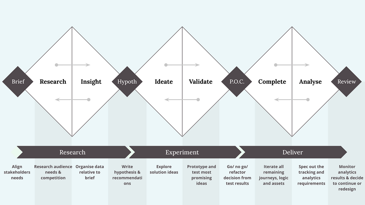
I usually build my processes using the "Tripple Diamond" methodology
Immersion
Business Objective:
Improve the user experience of the site. If people become more engaged with content and information, their loyalty will increase. As a consequence, new fans, supporters and viewers will emerge.
User Objective:
Have a single resource where users can find out about the club, upcoming matches, news, stats and results.
Audience:
Age: The main audience is between 18 and 45 years old, mostly man.
Local community: Because our club is local, the target audience is people who live in the area where the soccer club is located and are interested in its activities and events.
New visitors: Over 60% of our audience are new visitors, indicating that our website is attracting the attention of new users. This could mean that we have the potential to attract new community members and expand our audience.
Interest in sports and soccer: Our audience is interested in sports and soccer. They may be looking for information about local soccer events, game schedules, news about the club and players, and opportunities to participate in events or support the club.
What’s our success?
Minimum Plan:
- Daily Active Users (DAU): Increase the number of unique users who interact with our website on a daily basis.
- Session Duration: Tangibly increase the amount of time users spend on our website in each session. Longer sessions usually indicate deeper user engagement.
- User Engagement: Improve users’ overall interaction with your website, including the number of pages viewed, content interactions, and utilization of site features.
Maximum Plan:
- Bounce Rate: Significantly lower the percentage of visitors who leave website after viewing only one page. A low bounce rate indicates that content is attracting users and keeping them on the site.
- Increase Annual Active Users AAU (Annual Active Users AAU) through new active users.
- Increasing Retention Rate: Making new visitors fans, supporters or readers of our portal.
Discovery & Design Research
Structural map of FC Temp website and pages
To effectively identify growth points and possible problems, I examined the entire structure, pages, and content.
Examine metrics and available data
To understand the key points and pages of interaction, I used the “Views” data I collected and got a clear idea of which pages I’d focus on. I also calculated the percentage of users that interact with the players’ dedicated pages and their statistics.
Top 3 most visited pages
- 38% – Home Page
- 16% – Match Center page
- 9% – dedicated Player pages

Work in progress...
This project is a work in progress, so will be added to as the processes progress.
Stay in touch!

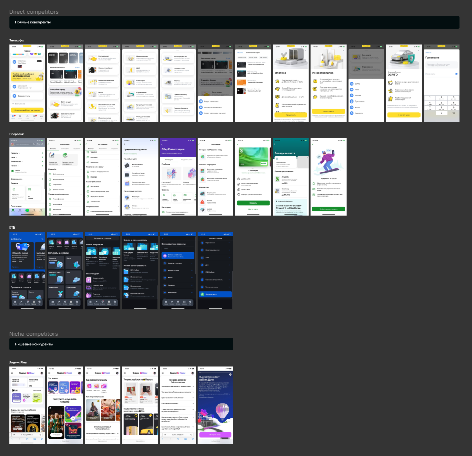
Competitors Benchmarking
Why Benchmarking?
To Observe Similar Functionality of Competitors: Identify strengths and weaknesses and best practices of competitors.
To Avoid Accidentally Replicating Competitor Solutions: Create something unique, better, and competitive.
Objectives of Benchmarking:
- Observe and document strong solutions and features
- Track mechanisms that can engage users and facilitate user interaction
- Understand common features to maintain predictability and expected patterns of user behavior in the concept
- Highlight solutions, mechanisms and features and draw conclusions
Conclusions of Benchmarking
1. Dedicated Section for All Bank Products and Services
It’s not just a whim but a necessity for cross-selling and increasing Year Revenue. For all competitors with a large number of similar products, it’s important to extensively display them in the mobile app and provide users with the opportunity for self-service.
2. Accessibility of the Showcase in the Tab Bar
Access to the Showcase should remain in the tab bar as it enhances accessibility. Two out of four direct competitors place a link to the product section directly in the tab bar, making it significantly more accessible.
3. Maintain Familiar Patterns with New User Experience
Since users can compare bank offerings in different apps, it’s important to maintain familiar patterns but provide a new user experience in interacting with the bank. All competitors use similar templates and ways of presenting core products and services but try to restyle them to create a unique user experience.
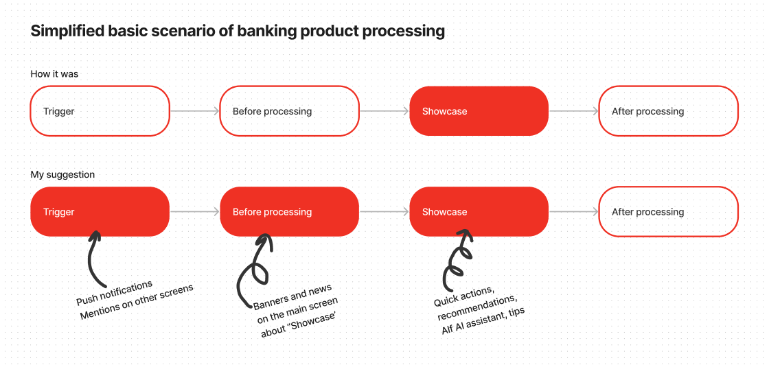
4. Subtle Hooks for Transitioning to the Showcase
Subtle hooks to transition to the Showcase on the main section should be added. Three out of four competitors extensively consider the scenario of purchasing bank services and place links to their products on the homepage.
5. Modern Visual Content Reinforces Positioning
Modern visual content strengthens positioning and creates anchor points for textual content. All competitors invest in modern visuals, icons, and accompany them throughout the user journey.
6. Categorize Bank Products and Services Bank products and services should be categorized to avoid a “dumping ground” effect. Each competitor uses categories to organize
7. Refine Recommender Slider and Add Quick Actions
Refining the recommender slider and adding quick actions is necessary. Each competitor uses recommendation technologies based on preferences to engage users. Additionally, three out of four competitors use quick action blocks to increase average time spent in services and lower the threshold for initial service setup.
8. Add Engaging Bank Services
Adding engaging bank services such as Points, Miles, and Voice Assistant is crucial to increase retention and provide additional motivation for exploring the Showcase. All competitors focus on cross-selling their financial services, mentioning them or offering unique deals, which increases product exposure.
Public Research
I evaluated the time required to complete the test and decided to study open research on bank users. The research results formed the basis for hypotheses.
Main triggers for product choice – namely, the best conditions. When a person needs a banking service, they are willing to consider it in several banks. 9 out of 10 respondents are open to changing banks for better conditions.
- 52% are willing to consider 1-2 well-known banks
- 22% – only well-known financial institutions
- 20.5% are willing to choose any bank if the conditions are favorable enough
The most influential factor when choosing a bank product is recommendations from friends and family.
When choosing a credit organization, clients pay more attention to reliability and convenience.
Most debit card holders learned about the product through recommendations from acquaintances.
Introducing a credit card to bank clients usually starts with an offer from a bank employee – this was the response of about a third of the respondents. The key factor in choosing a credit card was the conditions of the grace period.
When choosing savings products, customers consider favorable additional conditions to be the most important, giving clients flexibility – the ability to partially withdraw, replenish, and capitalize interest.
Remote account opening is the second most significant factor, as indicated by about a third of all respondents. However, only 27% of clients pay attention to the interest rate as the primary factor in their choice.
For 28% of consumer credit clients, the interest rate has become the determining factor in choosing a product. For 23%, the absence of paperwork for submitting an application is important – they noted the importance of a small package of documents, and the same percentage of respondents indicated a suitable loan term. Approximately one in five respondents considered the speed of loan approval to be the most significant factor.
Formulating Hypotheses
General hypothesis
If introduce product categories and show the main offers and conditions, the time in the Showcase per user will increase and there will be an increase in leads to product discovery and CR to active users, because people at the top level choose services in several banks and make a decision based on the best conditions.
Other hypotheses
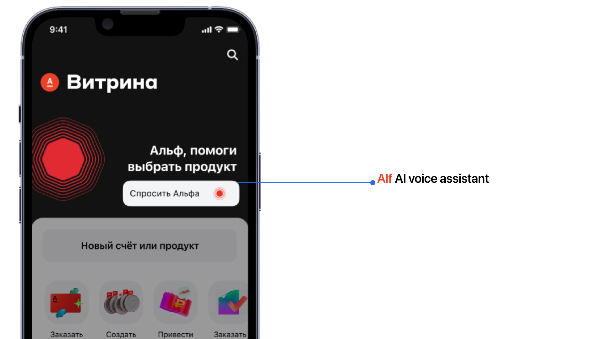
1. Alf voice assistant
If you add Alf voice assistant to the Showcase, the time of stay in the Showcase will increase and the number of leads to product discovery will grow, because Alf is able to answer questions and suggest suitable products and services + users have already formed a habit of communicating with voice assistants.
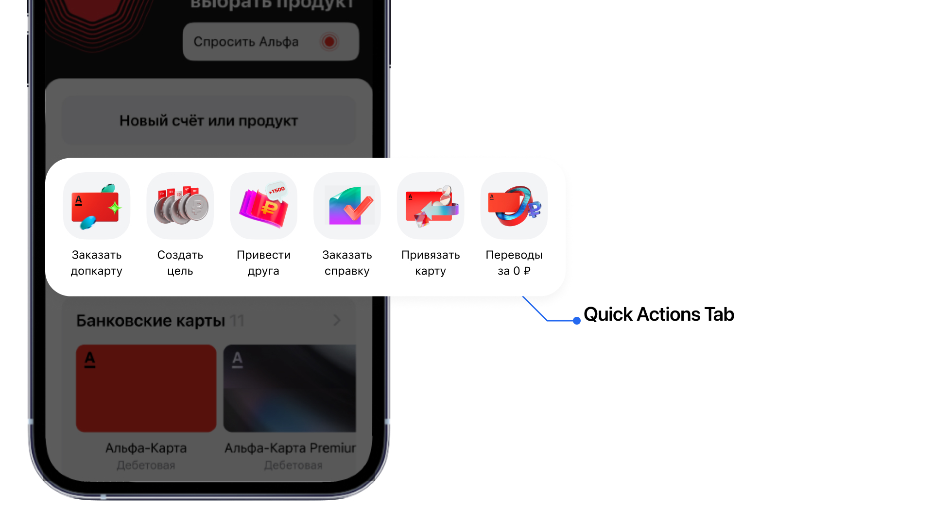
2. Quick Actions
If you add quick actions with services and services, Open Rate will increase because people will regularly open Showcase and take actions.
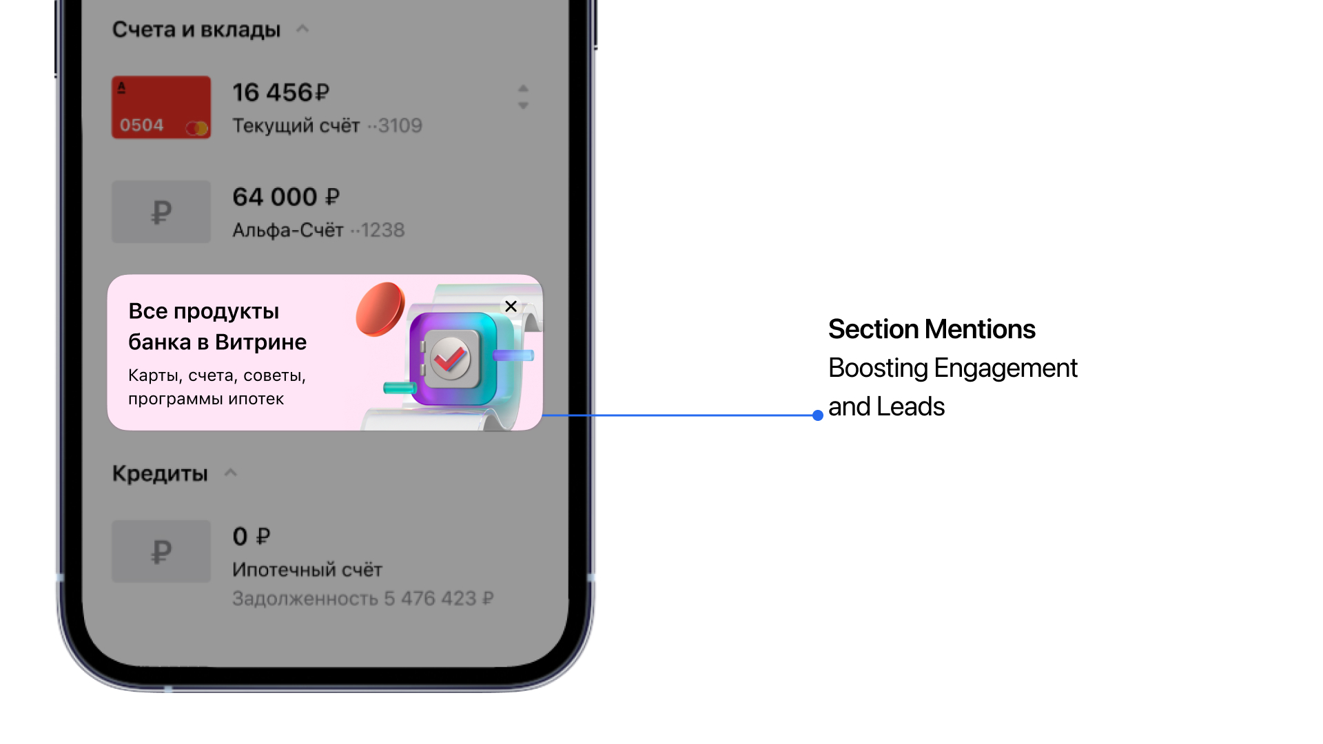
3. Mentions in sections
If you add unobtrusive hooks on some sections with the transition to the Showcase, the Open Rate and the number of leads to product discovery will increase, because the bank’s products will become obvious and the bank will be able to teaser interesting new products.
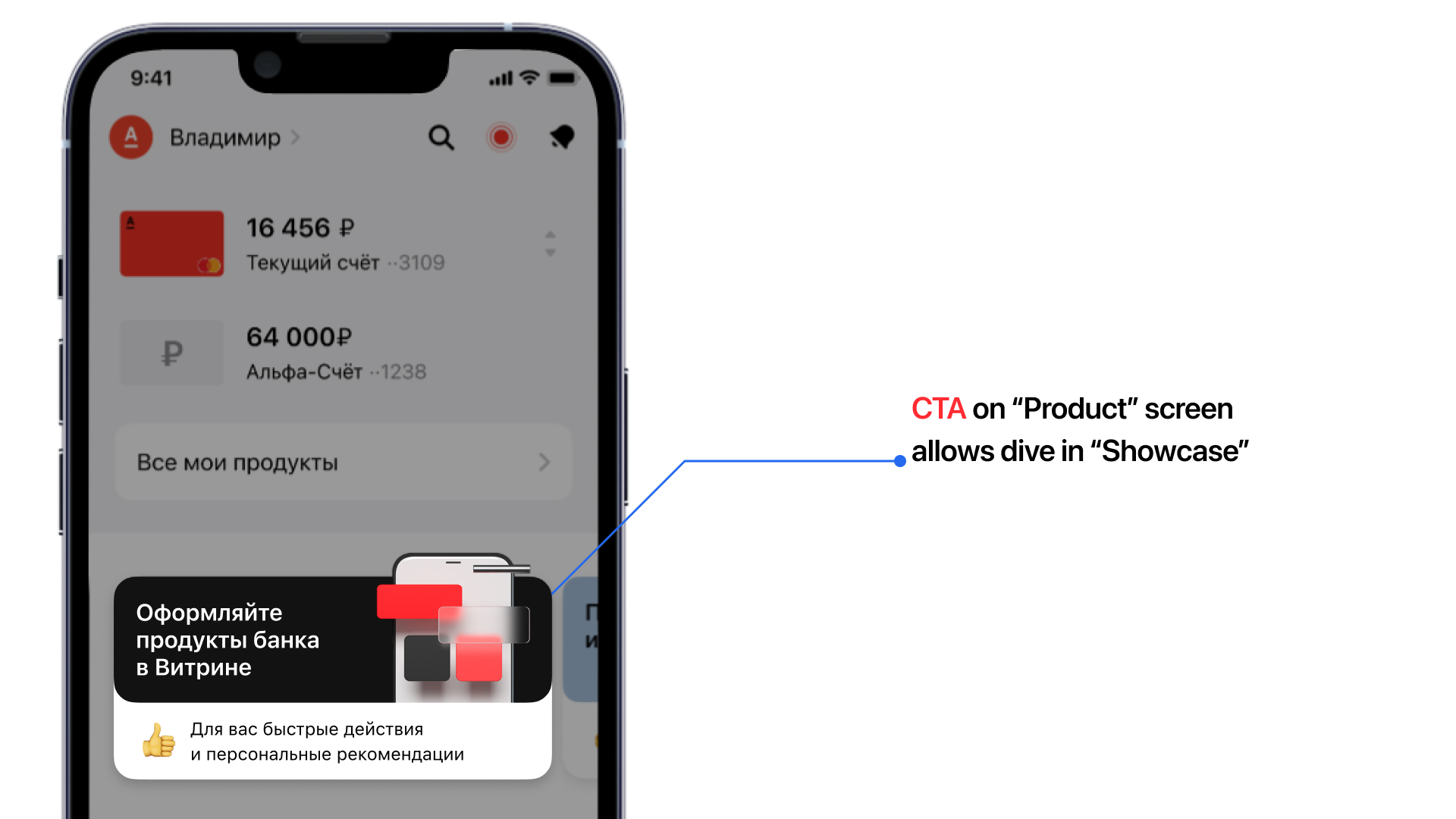
4. News on the main section
If you tell users on the main section about the updated Showcase, Open Rate will increase and dwell time will grow, because people are interested in new things.
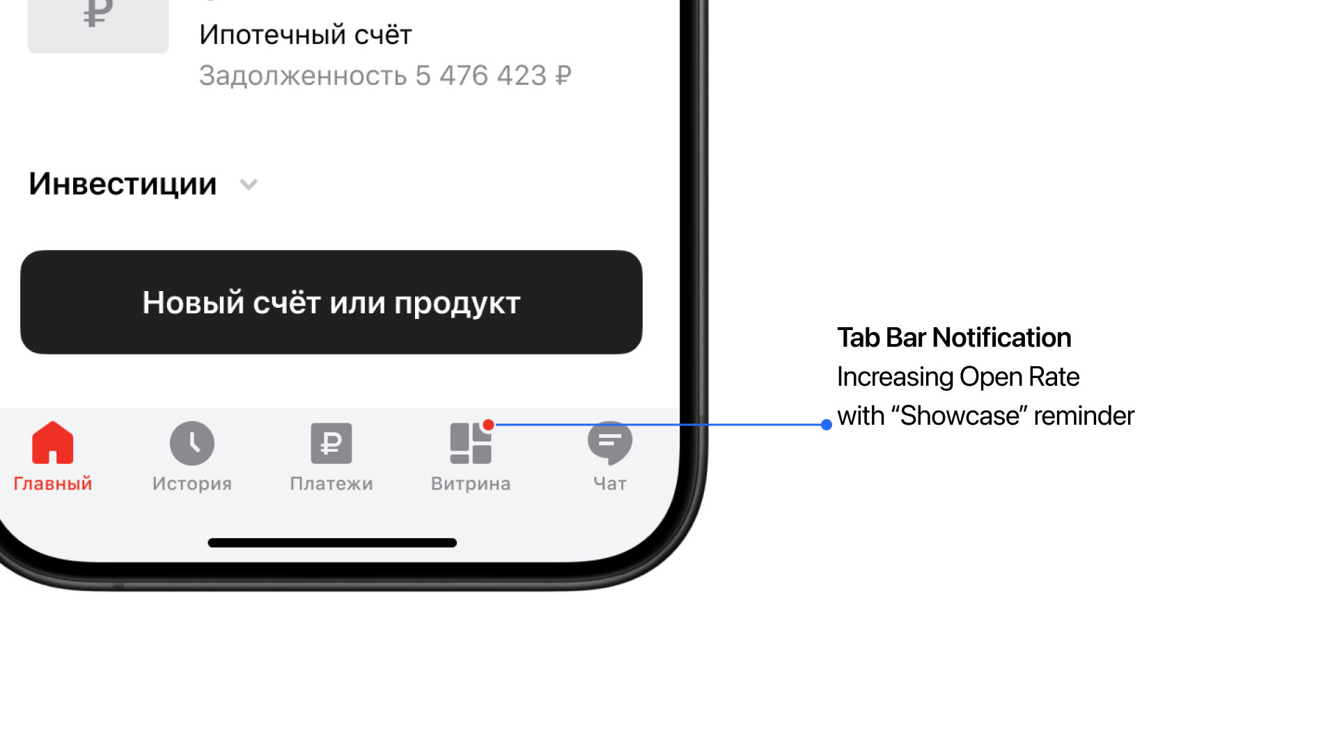
5. Tab bar highlighting
If you highlight the Showcase in the tabbar when new products or a new recommendation is released, Open Rate will increase, because people will remember the Showcase more often and come back to it.
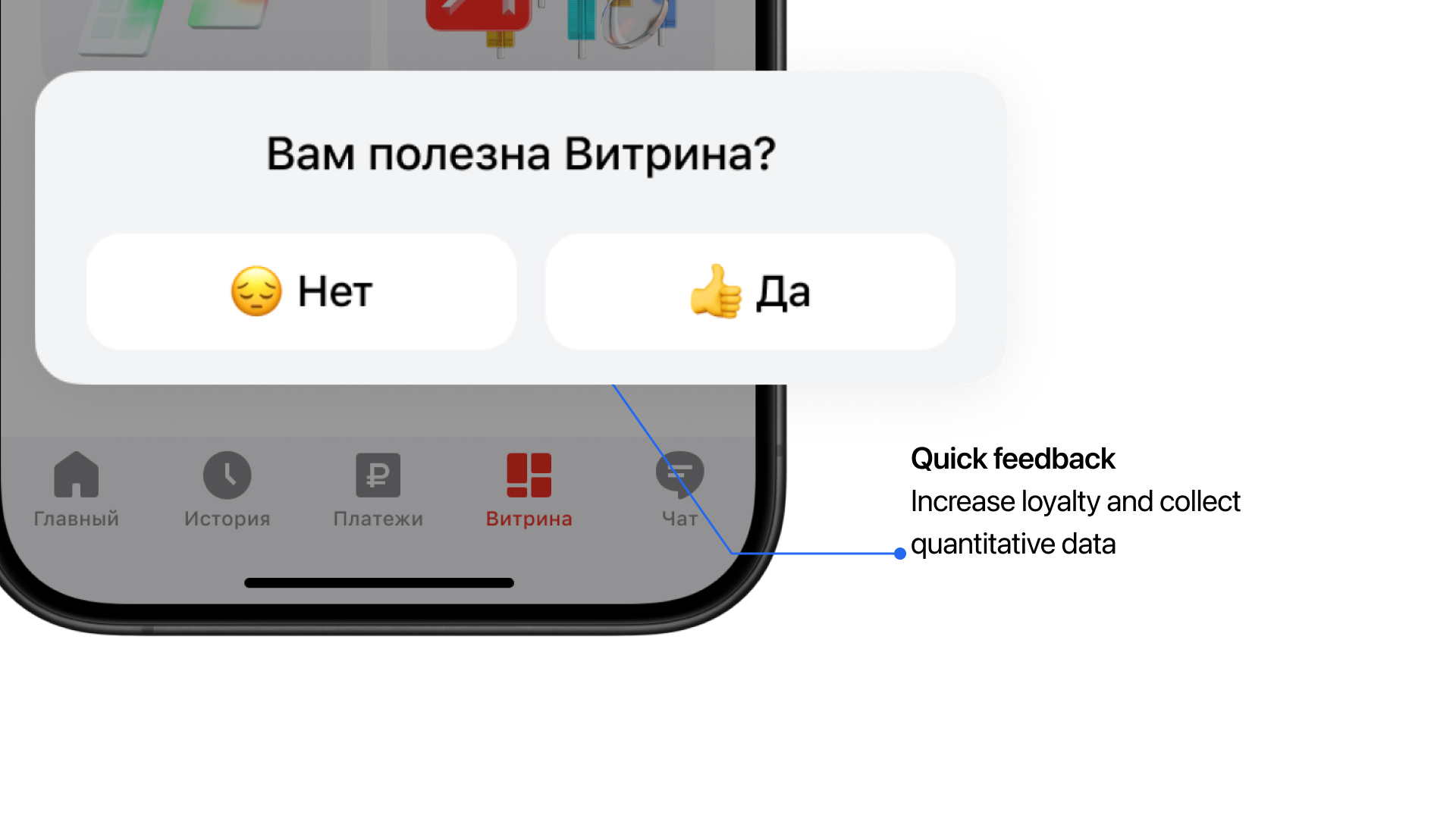
6. Quick Feedback
If you add a short questionnaire at the end of the section “Did you find what you wanted?” or “Was the Showcase useful to you?”, quantitative feedback will come in that can be used for the next iteration of improving the section, because it is important for Alfa-Bank users to leave feedback.
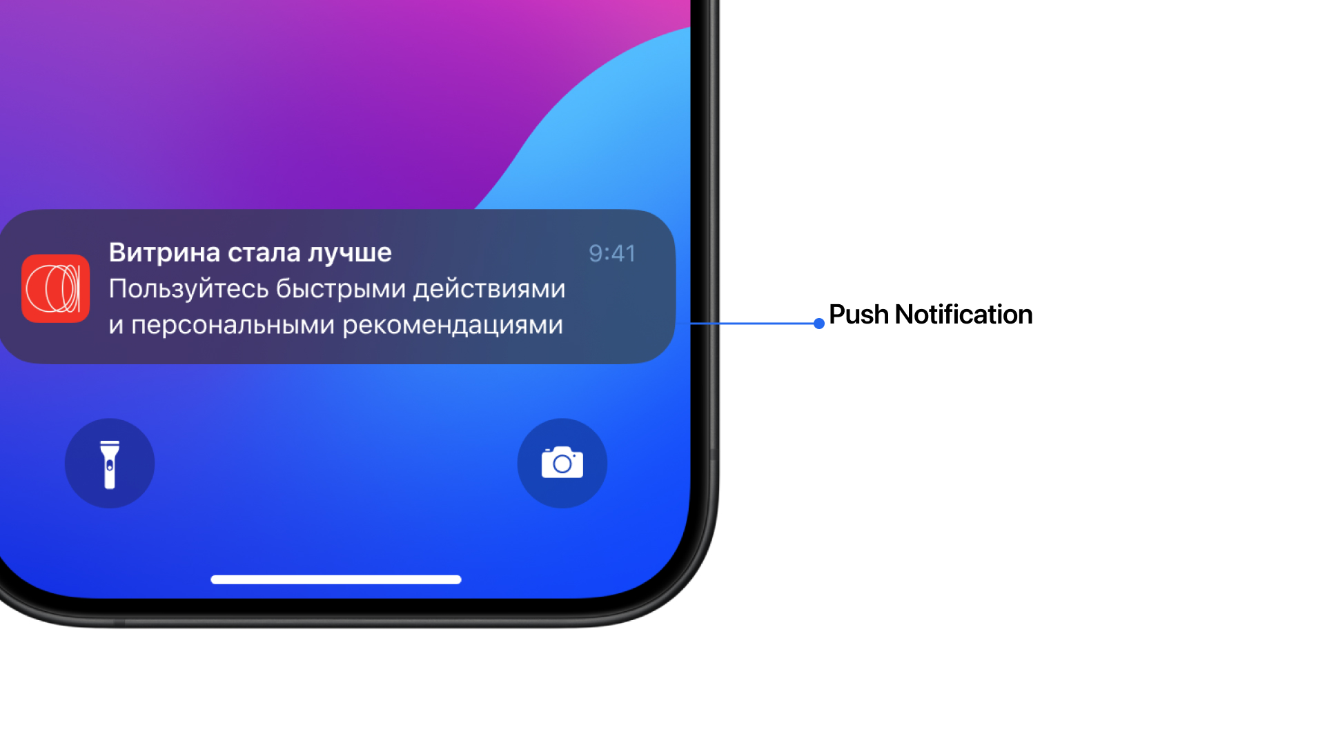
7. Push notifications
If you remind users with rare pushes about Showcase, Open Rate will increase and CR to active users will grow, because people will get the habit that they can go to Showcase for all products and services of the bank.
Formulating Hypotheses
General hypothesis
If introduce product categories and show the main offers and conditions, the time in the Showcase per user will increase and there will be an increase in leads to product discovery and CR to active users, because people at the top level choose services in several banks and make a decision based on the best conditions.
Other hypotheses
1. Alf voice assistant
If you add Alf voice assistant to the Showcase, the time of stay in the Showcase will increase and the number of leads to product discovery will grow, because Alf is able to answer questions and suggest suitable products and services + users have already formed a habit of communicating with voice assistants.

2. Quick Actions
If you add quick actions with services and services, Open Rate will increase because people will regularly open Showcase and take actions.

3. Mentions in sections
If you add unobtrusive hooks on some sections with the transition to the Showcase, the Open Rate and the number of leads to product discovery will increase, because the bank’s products will become obvious and the bank will be able to teaser interesting new products.

4. News on the main section
If you tell users on the main section about the updated Showcase, Open Rate will increase and dwell time will grow, because people are interested in new things.

5. Tab bar highlighting
If you highlight the Showcase in the tabbar when new products or a new recommendation is released, Open Rate will increase, because people will remember the Showcase more often and come back to it.

6. Quick Feedback
If you add a short questionnaire at the end of the section “Did you find what you wanted?” or “Was the Showcase useful to you?”, quantitative feedback will come in that can be used for the next iteration of improving the section, because it is important for Alfa-Bank users to leave feedback.

7. Push notifications
If you remind users with rare pushes about Showcase, Open Rate will increase and CR to active users will grow, because people will get the habit that they can go to Showcase for all products and services of the bank.

Hypotises value
Hypothesis prioritization
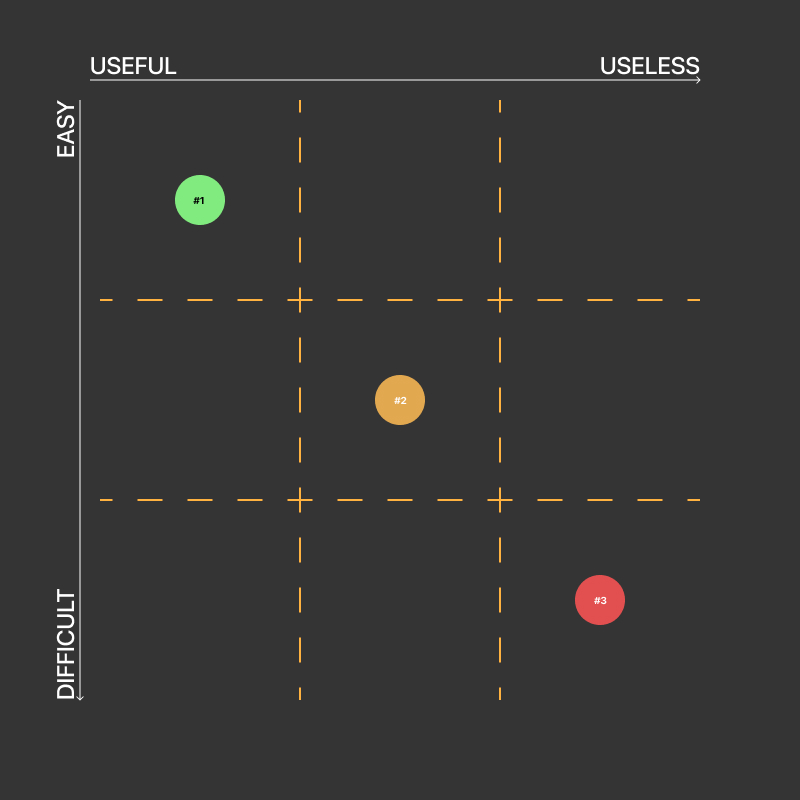
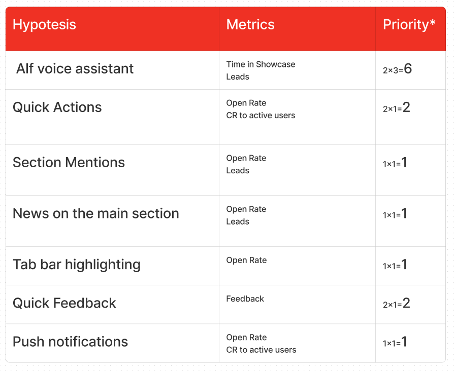
After marking the hypotheses, I used a Prioritization matrix to compiled and prioritized them. Some hypotheses are harder to develop and integrate into an application, others are easier.
This work is usually done with prodact, so you don’t get lost and have a clear plan to follow to get to the outcome. Also, to work a bit with the hypotheses and discard inappropriate ones.
Method for Calculating Priority
I calculated priority by multiplying two parameters value*complexity:
Value: This represents the anticipated benefit of the feature. It’s rated on a scale from 1 to 3:
- 1 — High value
- 2 — Medium value
- 3 — Low value
Complexity: This reflects the implementation difficulty in development and the overall product. It’s rated on a scale from 1 to 3:
- 1 — Low complexity
- 2 — Medium complexity
- 3 — High complexity
Finally, layouts and Low-Fidelity prototypes
What was this whole journey for?
I’ve compiled all the introductory details about the bank and its product structure, synthesized insights from open research and benchmarking. Through this process, certain principles emerged, shaping the following conclusion: The Showcase embodies the bank’s essence, aiming to captivate users akin to a bustling city square or dynamic marketplace. It must uphold transparency, providing users with unfettered access to information, empowering them to explore freely, make informed decisions, and meet their needs.
I present to you concept for the new “Showcase” in clickable prototype
Hallway and A/B testing
How did I test it?
There wasn’t much time for a test assignment, so I took three nearby respondents, surveyed their experience of choosing bank products. Then I gave them simple tests to find something through the “Showcase” and at the end conducted a small A/B test to find out whether it got better or not.

What are the conclusions of the tests?
The Hallway Usability Test showed two significant shortcomings of the past Showcase:
- Respondents felt that there was nothing to do there
- One respondent noted that he doesn’t even remember the Showcase and almost always doesn’t see it in the app. Does everything through search
- Respondents described the section as a big “dump” of products, which is hard to navigate through
The A/B test brought up an interesting idea:
One respondent, a regular Alfa Bank customer, suggested separating payment stickers, family accounts and cards in Showcase, as he himself was often confused by the general listing of products.
As a result, I made final adjustments to the design and that’s it.
How did I apply the findings?
Here I show in a basic scenario of interacting with the Showcase my suggestion how to impove it
Thank you for your time and attention! I hope I’ve closed all your questions about my design process.

